The infamous tension between an architect with creative ideas and a structural consultant with a knack for practicality often creates multiple thoughts in the minds of the clients and leaves him in a state of confusion.
Though columns are an integral part of the structure and removing the load bearing columns is just impossible, there are numerous creative ways to turn that negative space around the column into an interesting, useful space.
So it’s time we all think of alternative options of changing that structural necessity into an asset by using our aesthetic skills and powers.
Listed below are a couple of innovative ways to address the issue of using extra space around columns for functional purposes.
Innovative ways to Address Extra space around Coloumns
1. Division of Open Plans
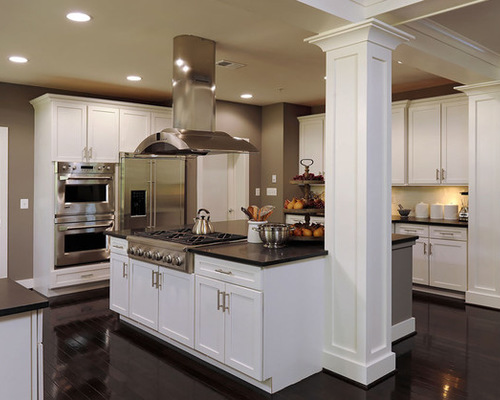
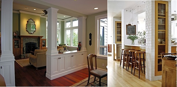
Make use of the existing columns as a pivot to anchor a breakfast island. Basically plan the interiors in such a way that the existing column becomes an intergrated part of the furniture layout and does not stand individually as an eye-sore.
Also, the columns can be used to pivot a bar counter and there use it as a separating element in a large living room. In this type of a layout, the floor remains consistent but the columns acts a physical and a visual barrier, which helps to separate out the kitchen area from the living room.
2. Using Columns as Indicators
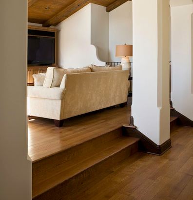
An innovative way of using a row of columns is to indicate a level difference or a level change in the floor. Having a row of columns makes more sense because they act like an ‘invisible wall’ and at the same time make the person conscious about the level difference while walking.
3. Using Columns As Storage Space
Structural columns are a great way to store things in the house. When you add built- in features like a cabinet, or shelves, or bookcases, you automatically improve the aesthetics of the column and make it functional at the same time.
Storage units that run from one column to the other should be kept a little below the knee level to enhance the volume of the room. These storage units, if designed according to the décor, can act as partition walls between two spaces.
They visually mark separate functions and give a striking look to your space. If the built in storage is running full length, right from the ceiling to the floor, then it is a good idea to have empty voids in between to avoid the cluttered look.
4. Increase Visual Space
Since nothing can be done to get rid of the massive columns in the centre of your house, it is opportunistic enough to turn them into elements which increase the visual space. Columns painted in light colors make the room seem more airy and spacious. The columns reflect more light and make the space a more habitable.
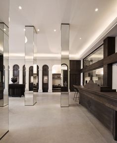
Another brilliant of increasing the visual space is to clad the huge columns with mirrors. They not only make the room seem bigger, they also increase the volume of the room. If the column is placed in the direction of an unobstructed window, it is an amazing technique to reflect the nature into your house.
5. Accentuate the column
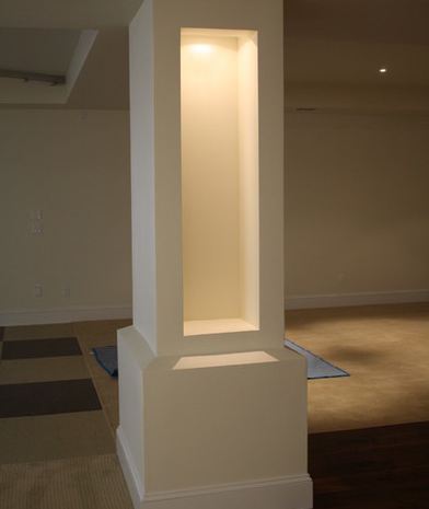
Make the dull column a centre of attraction by using downlights or a light display box. Insert a piece of sculpture or art and compose it In a way that it looks classy.
6. Use Column as a display
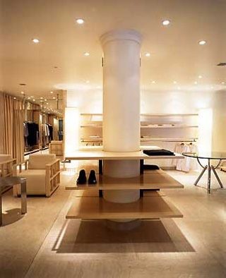
If there is a column at the centre of a store, then might as well use the column efficiently by using it to display the product. With column being the pivot, let the wooden planks be attached to the pivot to use as a base for display.
A similar condition in a villa can be handled by using such columns to display shoes, or clothes in a walk-in wardrobe. Also, the last plank can be a little bigger and stronger to let people sit on it and try on the shoes.
7. Insisting on Custom Coloumns
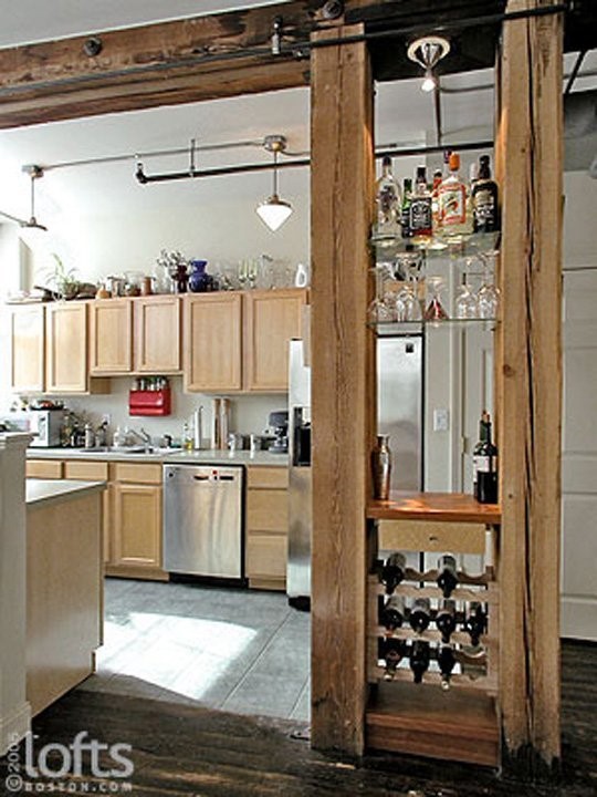
If the proposals are shown to the clients before the construction actually starts, at one or two places, the client can insist on having two smaller columns instead of one huge column.
This arrangement gives you the freedom to use it like a wine rack or display your precious alcohol. However, this alternative may not always work.
8. Putting Emphasis on the Hallway using a Colonnade
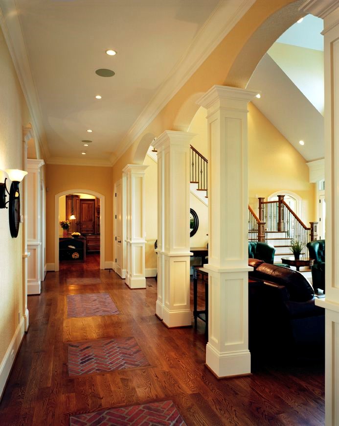
A lot of times false or pseudo columns are inserted in between the load bearing columns to give the feeling of a colonnade. Though these are non-structural elements, they look exactly like the load bearing ones and are only used to accentuate the perspective.
9. Using Columns to Narrate a Story
If the spaces demands, the columns can be a good way of narrating a story. The huge massive volumes can be good means of storytelling. These feature columns can be used wisely in museums or libraries, or at places where you expect a good influx of people.
Not only do these stories help in the aesthetics, but they are extremely interactive at the same time, which helps the people to indulge in a place better.

10. Recreating the Vintage Styles
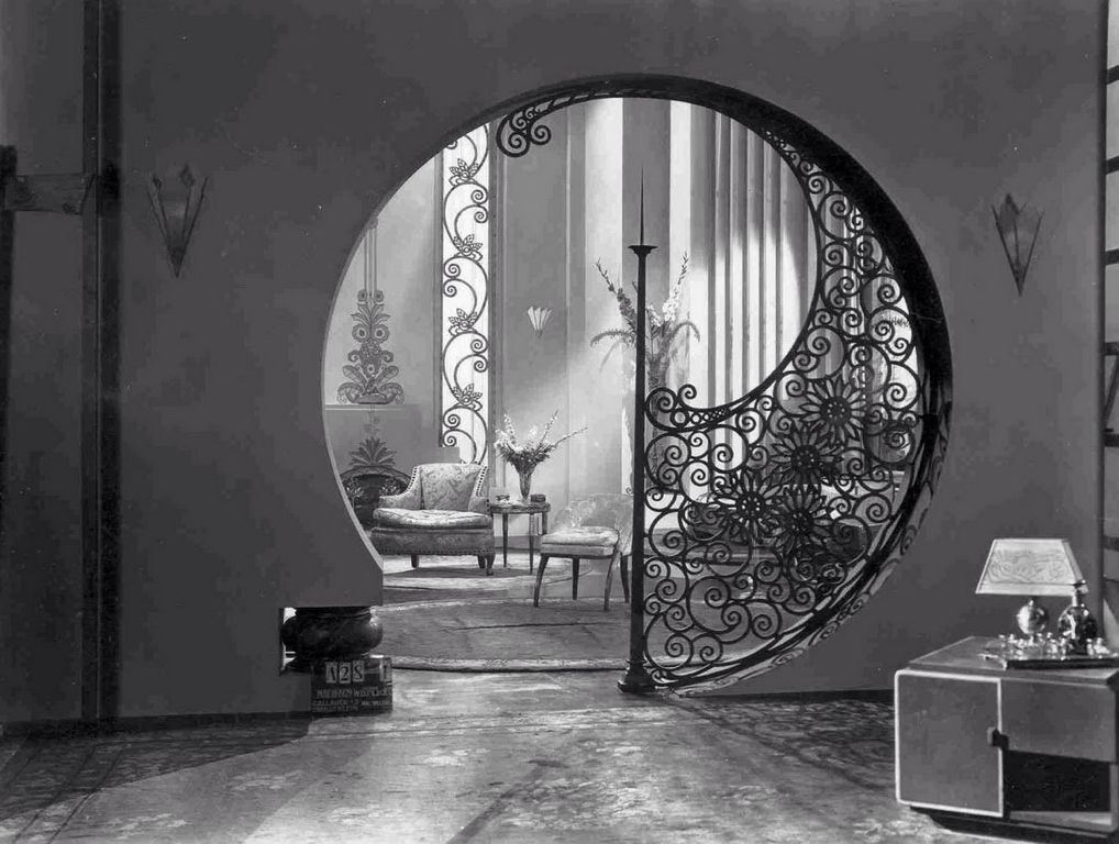
We are all familiar with how columns can sometimes slaughter the vibe in a room, but instead of letting it blemish your space why not seize the opportunity. A false partition wall like the one shown below can be constructed between two columns to highlight the art nouveau elements that happen inside.
– Ekta Shah


