Rectangular living rooms can look busy if they are not well planned.
to avoid the “corridor effect” that the long walls of the room can produce with the placement of the Sofas and TV. It can be challenging to create a rectangle living room. There may not be much space to artistically arrange all of your furniture due to the long and narrow layout.
From selecting the appropriate furniture to setting it up properly. We’ve got everything covered in this guide, from the right wall colours to the right furniture for your living room.
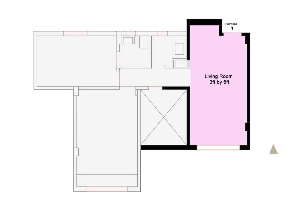
1.Decide on the room's purpose.
Understanding how to use your space effectively is crucial. Will the space be used by all of your family members? Would you like to gather with friends and family in your living room to watch movies, read, or hold meetings?
As a starting point for our planning, let’s establish some general needs.
- We require a place to hang out.
- We desire a flexible area that may be used for sleeping.
- A space for personal time.
- At least 6-person seating
- A planting area
- Book racks
- Storage space and large TV unit area
- Secret storage that can be useful for multiple purposes
- Shoe storage
- A coffee table or dining area
Once you have a general understanding of the living room’s purpose, you may consider the ideal furniture placement to fulfil that purpose.
Some important considerations for designing a living room are shown in the above illustration.
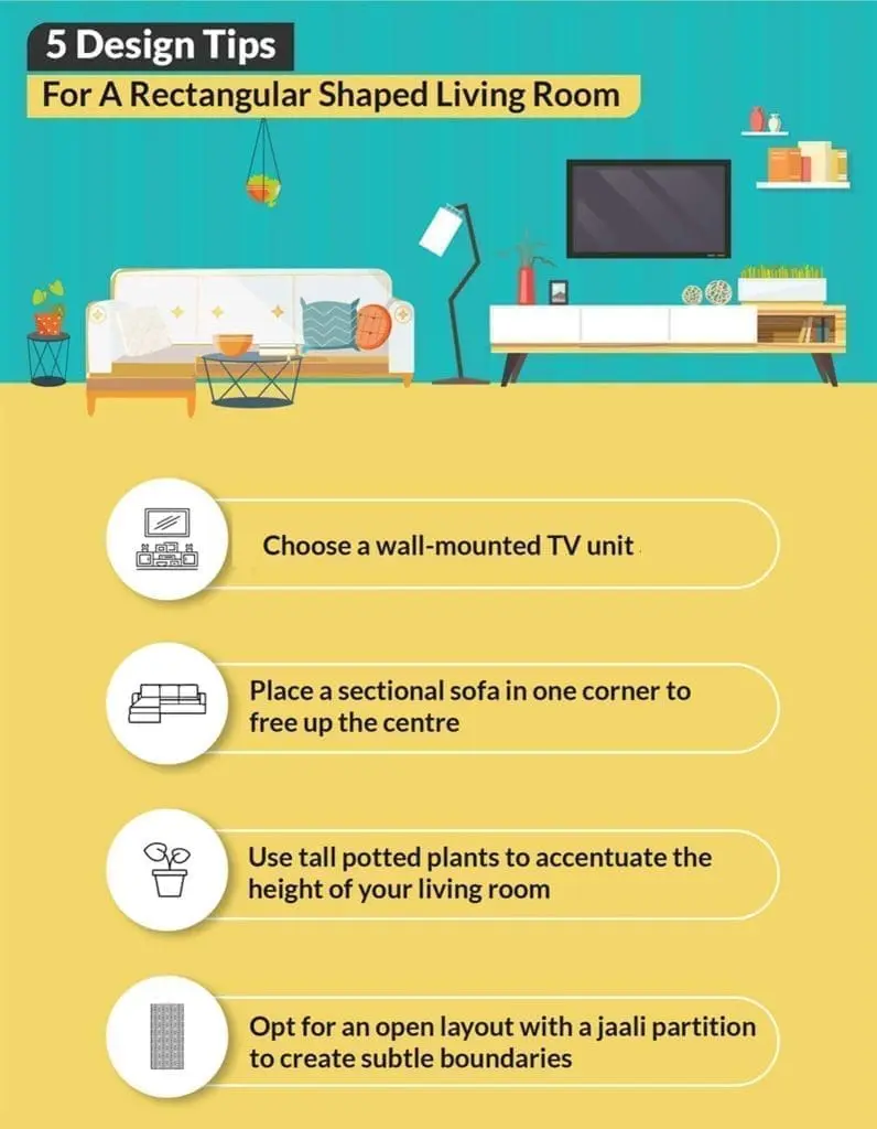
Some important considerations for designing a living room are shown in the above illustration.
2.Creating Zones.
Instead of viewing your room as a single long space, consider it more of an open plan environment with multiple zones.
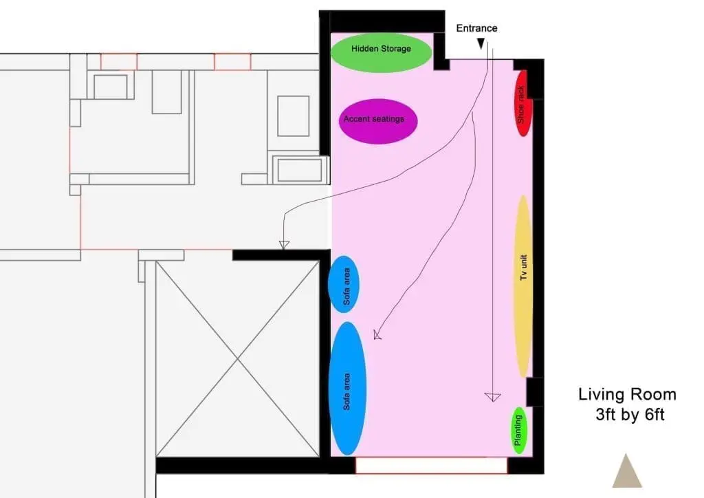
a.Sofa Seating
An ideal strategy would focus on parts rather than the total. The most crucial zone, the seating area, will be our starting point.
It will help to offer continuity and flow in the viewers’ eyes to plan sitting away from the entryway. A planner can choose a sofa with a separate accent chair in L shape at the corner facing the entryway to break up parallel planning. This lessens the corridor effect and helps to generate focused perspective.
b. Tv Unit
To prevent accessibility and visibility distractions, we will place the TV unit concept opposite the sofa zone. Tv unit will be placed on the wall that is visible from the door, enabling us to initially appear sleek and clutter free design.
c.Hidden Storage and Shoe rack
Now that the biggest, most important pieces of furniture are in place, you can concentrate on the corners. If your space is constrained, you might be able to add storage by adding shelves or a cupboard.
A closed-door storage unit is always useful and prevents the area from becoming overly cluttered. Zoning a rack behind the door at the corner of the column helps us to avoid having a large storefront right at the start.
d.Planting and Accent Showpiece
Including some vibrant elements improves perspective and adds colour, pattern, rhythm, and yes, balance to a sophisticated design.
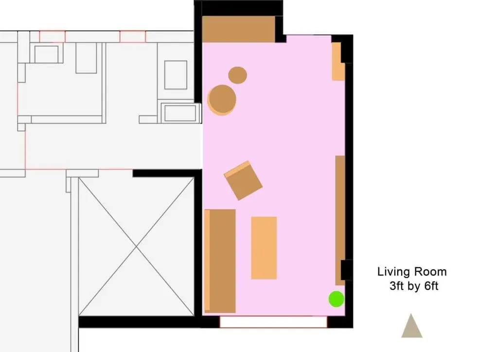
3.Planning and avoiding corridor effect
Here, we attempted to break the corridor effect by placing a curved chair at an amazing corner we encountered upon entering. Next, we attempted to select a sofa and rotate it in such a way that it could create an entirely different zone.
We are using long walls for our furniture in such plans due to our placement of doors at shorter walls. If we had entered through longer walls, we would have planned our furniture around them.
To create a flowing look in such rectangular plans, use small curved furniture such as sofa chairs and tables.
4.Detailing small things
It is said that God is in the details. The more you focus on details, the more you create a story in your design. It is not the mass that is remembered, but a detail that never fails to make a good impression.
a.Rugs to define a space
After you’ve decided on the function of your room and the zones, it’s time to bring in some rugs. These, more than anything else, help to define the areas.
Mixing shapes often works well, such as a large rectangular rug in the TV sofa area and a smaller round rug in the snug armchair area. This division of the room prevents your eyes from seeing it as a single long space.
b.Creating height in your room
Adding height allows the audience to see a space from all angles, avoiding the impression of a single long space. Adding tall units, large murals or paintings, and long antique pieces or plants can help us achieve such results.
The trick here is to choose furniture with legs. They make spaces look more open and spacious.
c.Adding colours and patterns to the space
Colour can help to change the appearance of a room. A darker colour on the end walls will shorten the room’s length and bring these walls closer to you.
Colour blocking, on the other hand, can work if you want to add something different to the long walls. When used correctly, it can help define different zones and break up the space.
Use sheer curtains to draw attention to your windows and let in plenty of natural light. To keep the scorching summer heat out of your room, pair it with thick curtains or blinds.
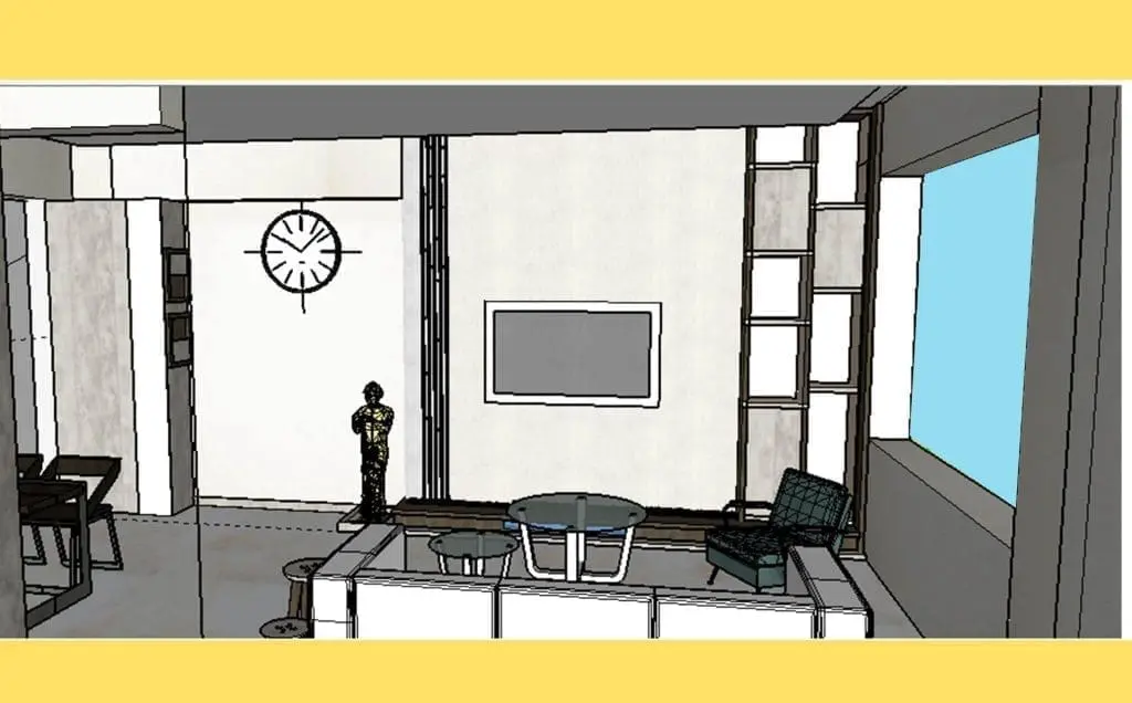
d.Adding Mirror to the space
Using a mirror in a larger space helps to reflect light and make the space appear larger. Using a bronze mirror or any other classy mirror on hidden storage can help to conceal or mass store items and double up space at the same time.
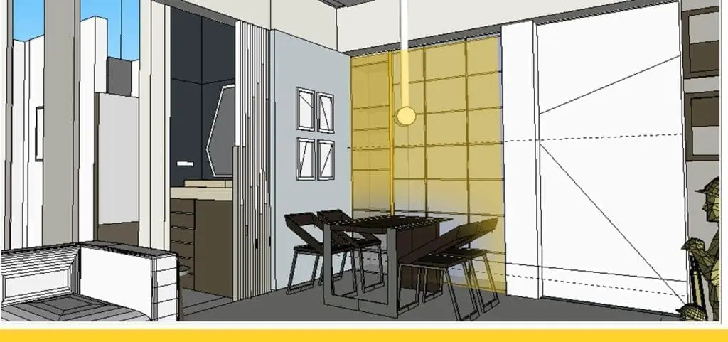
e.Ideal Lighting for a Rectangular Living Room
To brighten up your living room, choose a false ceiling design with cove lights in the panelling. Avoid hanging lights in the centre. However, you can use pendant lights to illuminate the corners.
f.Four Walls
To create the illusion of space, use muted colour paint, you can use solid colours, make sure to supplement them with plenty of lighting
Create a mental space, plan it, and execute it to transform a rectangular living room into a stylish living room and win the game.
– By Rashika Borona

