Floor plans are an essential part in the process of construction and design. It provides you with the whole visualization of how the space is going to be in future. For that, it is essential to learn the language of reading the floor plan, which is very easy as everything thing is mentioned in the plans.
The only important thing is to make out whether this floor plan is perfect for you or not. Read further to discover about these mistakes that are in front of you yet hidden.
Common Mistakes in Floor Plan
1. Every Floor Plan is not For You
Lavish is one thing and lifestyle is other. Every floor plan is planned accordingly, keeping in mind the lifestyle of the client and the people who are going to use it.
Once must imagine themselves into those spaces before making the final decision as you may not like climbing number of flights after a certain period or may not require partitions between spaces or vice versa.
Proper circular between spaces and the connectivity with the outside world are certain aspects to be considered while designing the floor plan. So, be firm while choosing a floor plan, as it is for your lifestyle.

2. Dealing with Dead and Corner Spaces
Once a space is constructed completely, it is next to impossible to change it. Sometimes, your plan has a lot of dead spaces that will generally be covered with dust and will not be used. Identifying these spaces in the plan is a must as rather than an unused space, it is also better to have an innovative setup that comforts you and your family by all means. It can be the at the end of the corridor or Corner spaces that can be used for cabinets and storage, etc.

3. Door Sizes and Door Openings
When a floor plan is ready, we move towards placing the furniture. The process is such that one must check before hand the sizes and height of the doors as the furniture that will be carried to the place should fit in.
You may have a factory made, or readymade furniture to move in the space. It can also be build inside the room but every space should have all possibilities of innovation and capabilities to inculcate any idea.
On the other hand, sometimes when you open the door, it may open in such a way that disturbs other functions. Two doors may clash sometimes. Sometimes you have to open one door close it and then open the other. So one must make sure about the door swing direction and the sizes of the door.

4. A Window without A View
Yes, it is right that every space should have a window that connects you to the outer world and maintains the cross ventilation. But, the most important factor is that what view the room is providing. Is it opening to a dead wall? Is it opening to other’s room, which is a serious case of today’s urbanization. However, your spaces may have windows, but do check that they are in the right direction.

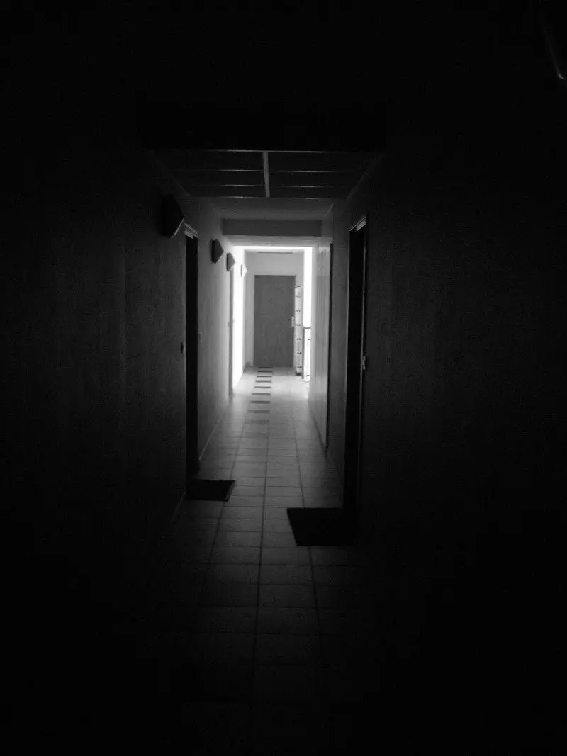
5. A Passage of Darkness
How a humans need natural light. The same way spaces too need it. Sometimes, your plan is designed in such a way that few spaces and corners lack the sufficient amount of sunlight they require during the day.
Thus, even during the day we have to keep the artificial light on which is not a good thing for the end users. Study of placement of windows, openings & skylights is essential to avoid the problem and mistakes.
6. Huge Spaces Won’t Make It Function & Lavish
Always, we think that increasing the size of certain space than required makes it more functional and lavish. Every room should be designed with the required amount of space as it will save on space that can be creatively used for some other functions and activities.
A kitchen that only requires a small space cannot be given a huge space which a bedroom needs. To avoid the mistake you can club the kitchen with the dining area to make it functional.
Therefore, planning accordingly is very essential for proper circular and making the spaces more functional.

7. Never Ignore Any Mistake
- Toilets facing living spaces. Toilets should be located at the right place where it is covered and not to be seen directly from the living room. To avoid awkward situations and a buffer space is maintained.
- If it’s going to be a two or more storey house, should have at least one room and a powder room on the ground floor, so that it could be accessed by old people, or could be used by you in future and any worker in house.
- Sometimes we forget to accommodate storage for day to day equipments. Large weird-shaped items need storage too: vacuum cleaner, brooms, and suitcases often have no home.
- Consider safety for little ones when choosing a floor plan: Proper installation of railing on the staircase, No pointed furniture as they will be a threat and not safe for the children.
- Use of fancy glass facades as used abroad, allowing the heat to pass through the glass and later on to solving the problem by buying shading devices and air-conditioning the entire space that leads to raising the costs for installation and purchasing of all these, contributing to air pollution in the process and not being happy about it at the end of it all. This is one of the bad practices and not a good sign of passive designing.Therefore, Build according to the weather and climate of the region, wind directions, sun-path and use materials that accommodate the climate of the region.
- Forgetting that plumbing takes up space. Dedicating proper space for the pipes and providing a sunk in the toilet is a must. Proper placement of ducts and shaft should also be considered.
- Inefficient room placement. One should never be made to walk through a kitchen to reach the bathroom. Do you want bedrooms right next to other living spaces or separated from the rest of the house in one wing of their own? This is one of the most common mistakes and should be avoided at all cost.
- Designing without the future in mind. Plan accordingly with regard with your better half. Whether you will be having kids in the near future or will be living in this home through your old age.
- Too few windows or areas for natural light. Incorporate windows and place them strategically to receive the most amount of light within your home. Similarly, don’t add too many windows. There should be a healthy balance of walls and windows
- Not accounting for traffic flow. The most used corridor for circulation between spaces is too small to accommodate two people at a time disturbing the flow of the day to day functions carried out. Proper widths should be considered and designed accordingly.
- Not putting in necessary hallways & vestibules. Hallways create a transition from one zone to another and provide the necessary buffer space. You may not like a vendor to enter your home and see all of it. Vestibules are a must in this place.
- Placing operational windows in locations where you will not open them as they are out of reach and probably you need a ladder to reach them makes no sense. A lot of dust will be accumulated on it, making it hard to clean and maintain leading to unhygienic conditions.
- On scale Furniture layout should be decided before to avoid problems later on.Draw every piece of furniture you want to include on a piece of paper on scale to get the idea and check whether the decided furniture will fit in your layout or not.
- Power points and switch boards at the wrong locations that disturb your lifestyle should be avoided, charging phones should be as easy as jumping on the couch.
- Proper position of furniture in relation with the doors and furniture as these objects has a relationship with the layout of the rooms so that they don’t obstruct access to doors and windows.
- Not paying enough attention to the placement of bedrooms. Bedrooms should be placed privately yet connected. You might want your guest’s bedroom to have some privacy and have their bedroom away from yours and vice versa.
- Not considering the house location: cardinal points, view, water sources, usual wind directions, existing trees on the property, etc. The house should be designed according to the orientation in relation with the directions. Proper incorporation of outdoor landscape and the structure is a must.
- Lack of storage space. Add specific storages for sport equipment, hobbies, collections, emergency supplies, large pantry by the kitchen, etc.
- All the services should be grouped properly, as it ensures proper function of the house. The entire plumbing unit should be grouped as it is also easy to maintain and keep the house clean.
- Proper planning is always essential as you cannot place a bedroom first that takes you to the bedroom. An entertainment zone cannot be placed beside a bedroom as it may disturb you while you are having a peaceful sleep.
All the mistakes differ from person to person and on-site situations. The best thing is that the following mistakes that are common in every floor plan can be avoided with proper planning and consultations. These mistakes arrive when you commit another mistake of doing everything yourself, making it difficult for you and even your family that is going to live in those spaces throughout.
You must take professional help, rather than moving forward. As it ensures proper planning and process of the final result. All the mistakes are in front of you before the execution making it easy to avoid it and having 0 errors in the design. Thus, You Have your design on paper ready with all the 3D renders and you just have to relax and look forward to see your design turning into reality.

