Every space is unique, but there are three most important aspects of the design which remain constant. These are style, practicality and attention to detail.
The design of hallways, a corridors, and entryways sometimes requires even more effort than the rest of the building.
Corridors are the silent space connecting two different spaces. They are peaceful but need to have some cool, dramatic design which will uplift your mood.
Apart from all the designing and decor things you need to keep your corridors spacious, well ventilated, and well illuminated by of natural light and artificial illumination.
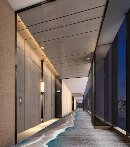
The design of corridors depends on the need of circulation in connection with specific space.
No hard and fast rule is used for the length and width of the corridor. But it is safe to design a corridor with not less than 1000mm width and the height should not exceed one and the half times of the width.
The corridor is very important and it should be designed in a proportion to the adjacent room.
Stylish Corridor Designs
1. Borromini’s Corridor
This is an example of ‘forced perspective’
The corridor is shorter and the sculpture at its end much smaller than they first appear.
The corridor looks to be around 35m long, when in fact it is less than 9m from front to back
It is a magnificent play on perspective. The effect was cleverly created with a gradually rising floor, converging walls and a descending ceiling.
2. Brumidi Corridor
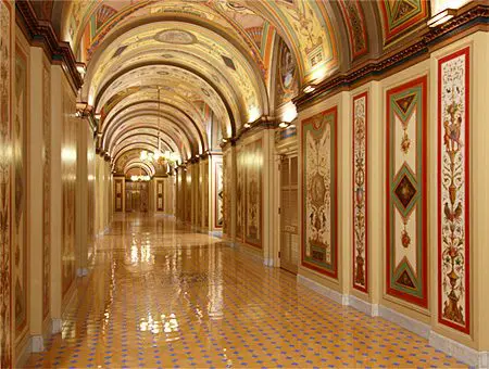
A variety of techniques were employed in the Brumidi Corridors.
The portraits and historical or allegorical scenes in the semicircular lunettes were created over the doorways in the difficult true fresco technique.
The story brought throughout the passage was making the passage interesting for the visitors.
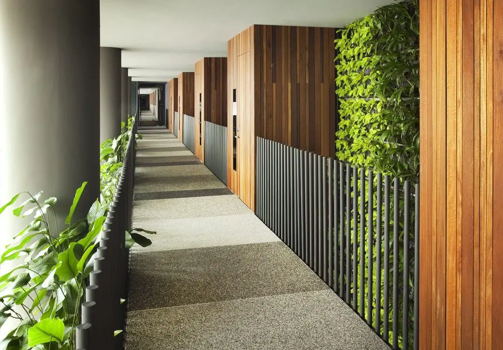
3. The Modern, Ventilated Corridors
The problem with all corridors, regardless of how grand, was ventilation.
In 19th century corridors were designed of “liberal dimensions” and “having an abundance of light and very cheerful in all aspects.
The corridor “helped reduce social stress because it gives a choice of spaces.
4. Commercial Corridor
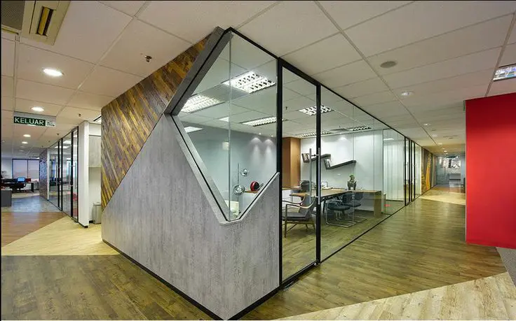
The passages in commercial buildings are designed to cater to all the cabins and areas of the sprawling office, allowing easy access to them.
The passage area can be designed with pieces of art exhibited on both sides.
The passage area is designed to reflect a luxurious yet modern concept, using textured glass panels, metals and woods.
The entire passage partitions are lit from below to give a direction or to create focal points.
5. Residential Corridor
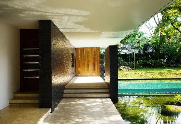
The design of the home and its corridor can be open to nature.
Private sections like pool or garden can be hidden from the corridor wall with some voids playing hide and seek with the nature around. This space is connecting the interior and the exterior space.
Pampering the corridor with the lights and some soft tints of colours are some additional design elements to get more of the sober and simple looks.
Elements to Create Stylish Corridors
Corridors are long so don’t extend their length by unwanted elements or over designing.
They are meant to be silent, cool, relaxing, sober and well connected to the rooms and spaces of the respective interiors.
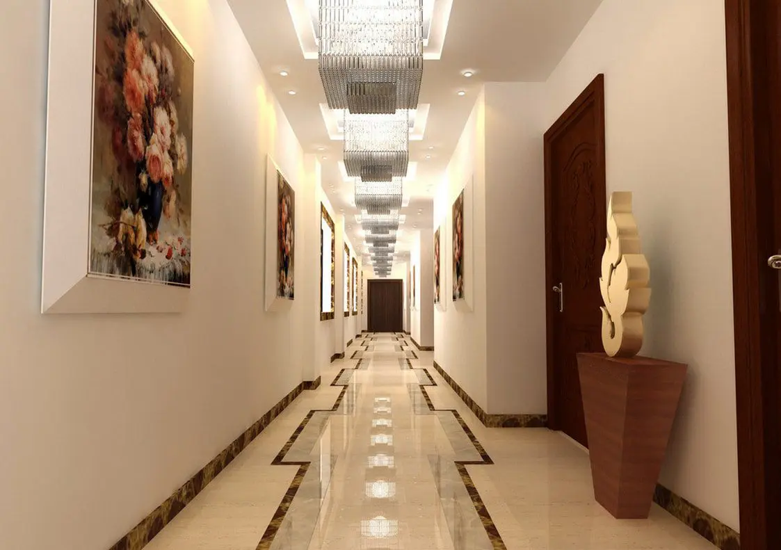
1. Painting and art Work
Adding up few interesting paintings through the walls give it a perfect silent speaking look.
Corridors with properly placed sculpture going parallel to light tone walls are the amazing pathway to walk by.
Such elements create an interesting interior corner throughout the space.
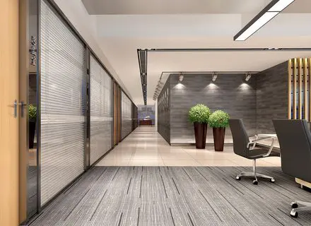
2. Indoor Plants
Plants can keep the indoor space more lively and cool.
It creates very positive impact with its green peaceful look.
Playing with the natural colours and keeping the wall with decent simple look is the simple but styling design step.
3. Seating Area
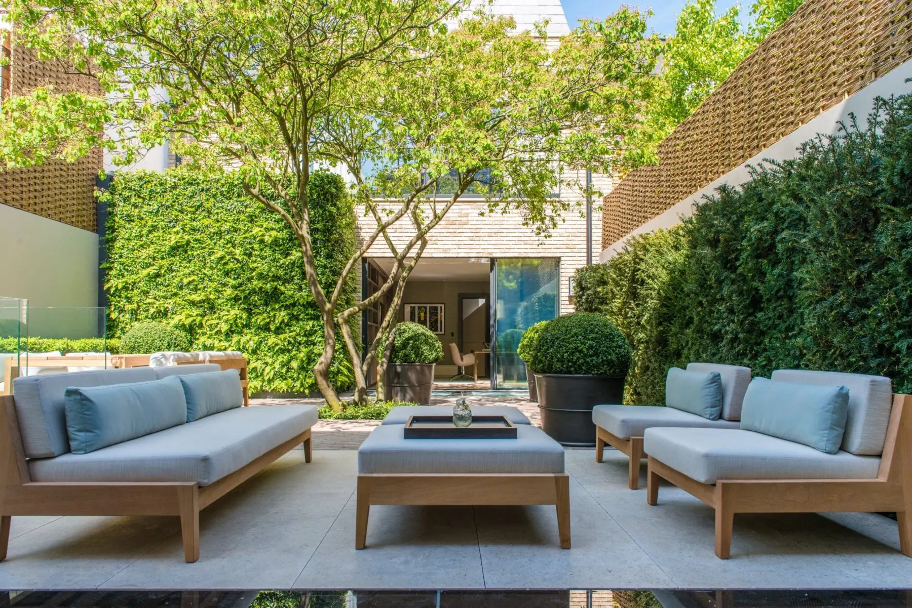
If the corridor is connected to veranda some interesting and relaxing space can be created by placing small coffee table with seating.
The space is more of interactive space for family and it is appreciated by all.
4. Texture Glass
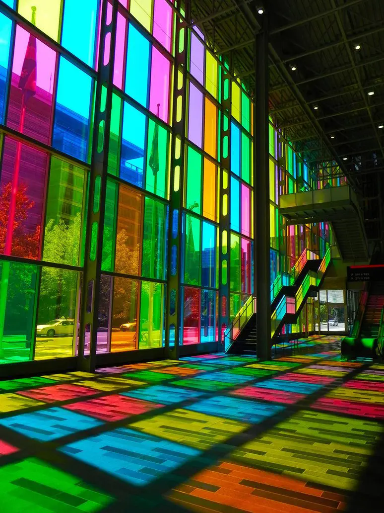
Glass walls with textured or itching effects can make the corridor look classic.
Unique and colourful stain glasses are the best way to play with light and dark colours.
Glass can make the formal space look stylish and not boring and this is the best way to treat office corridors.
5. Lights
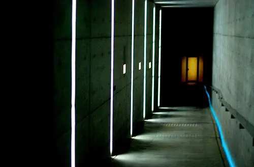
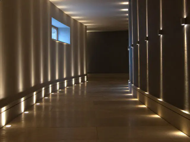
Blending the smooth texture of the four walls with soft and dramatic light can create the fascinate and simply atmosphere
Light play can make the sculpture or art work more beautiful and attractive.
6. Slit Windows
Why not play with the natural lights and shadows.
Slit windows cut out from the solid mass will be the clever step.
It will create appreciable and desired look.
