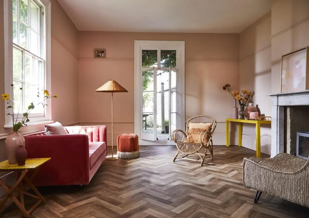
If you’re a keen design enthusiast, you must have heard or read about the term “negative space” in design journals, magazines, or Instagram posts. Unlike how it sounds, negative space is actually a useful component of a design.
When it comes to aesthetics and elegance, it can be a good technique to balance the visual gravity between different spaces of a room. Sadly, negative space is often disregarded as a design element while decorating a house.
This is because it can be difficult to plan for negative space because of its disproportion and uncertain placement. Here, we will discuss negative space in detail and analyze the possibilities that would help us make the best use of it.
What is a Negative Space?
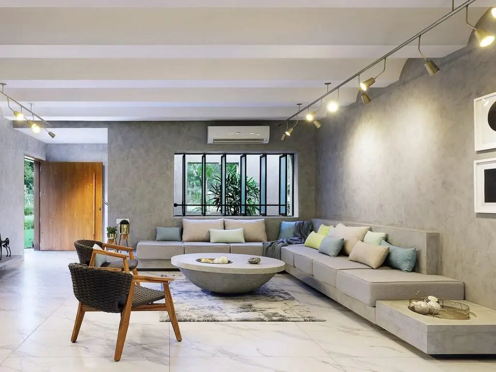
It is the empty space between two pieces of furniture or between furniture and a wall. Negative space doesn’t depend on the proportions of a room, neither it is practical. It is used to balance the positive space in the room, thereby creating breathing room within it.
It helps create balance and stability in a design. If the negative space used is too less, it will make the room feel cluttered. Likewise, if there is too much negative space, then it will make the room feel empty and aesthetically unpleasing. The key is to perfectly balance interiors that are furnished in a way that feels just right.
Living Room:
Living rooms are usually the largest rooms in your house. This gives us enough flexibility to leave some space blank and make the room look bigger. Consequently, it helps create a bright and airy space with lots of natural light.
Furniture:
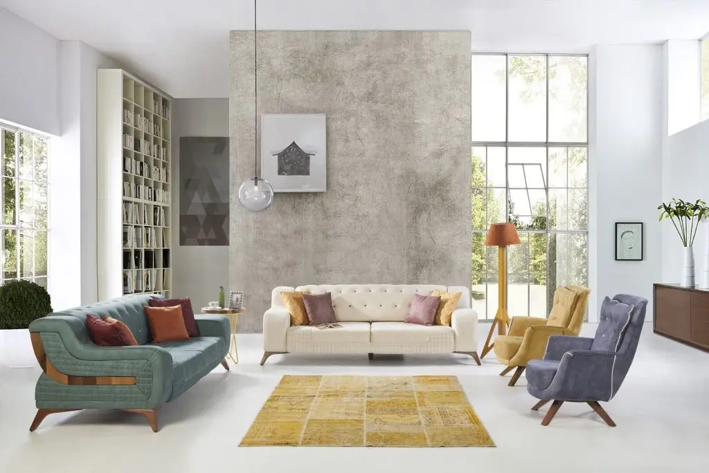
Furniture that sits directly on the floor will visually take up a lot of space. Instead, choose furniture that has legs, allowing the maximum part of the flooring to be left uncovered. If you’re still stuck on what works best for your living room, then opt for the simple yet elegant midcentury modern furniture. These pieces of furniture offer a balance between the positive and the negative spaces.
Walls:
Create a focal point with a wall, painting it in an accent color and hanging a beautiful piece of artwork on the wall, a decorative clock, or even a set of wall sconces. This will help draw attention to the wall in a positive way instead of a negative way.
Minimal Window Treatment:
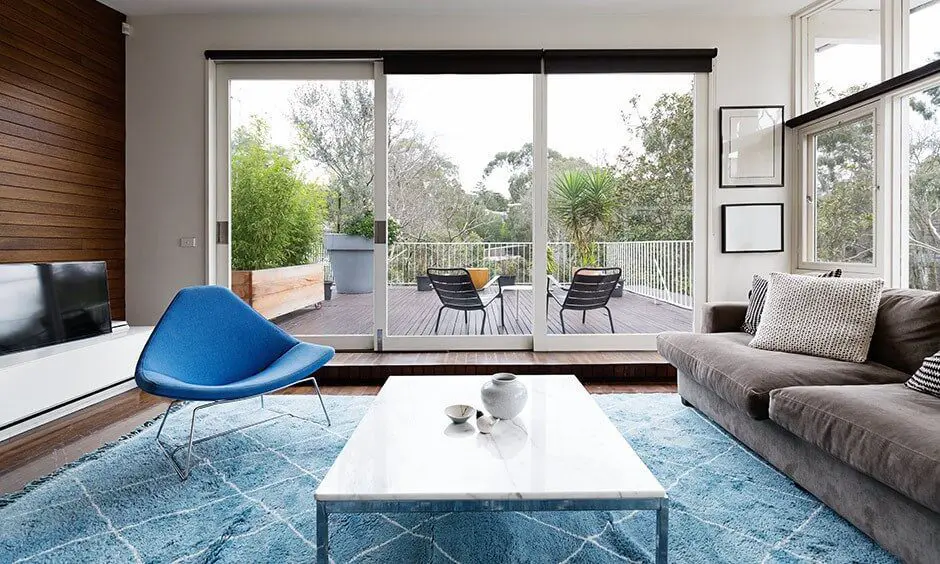
If you have a beautiful backyard, then why hide the view with the use of curtains or drapes? Additionally, if you have a glass window or wall, then all the more reason not to hide it. This will give an illusion of a much larger space and will also create the required declutter in your space.
Bedroom:
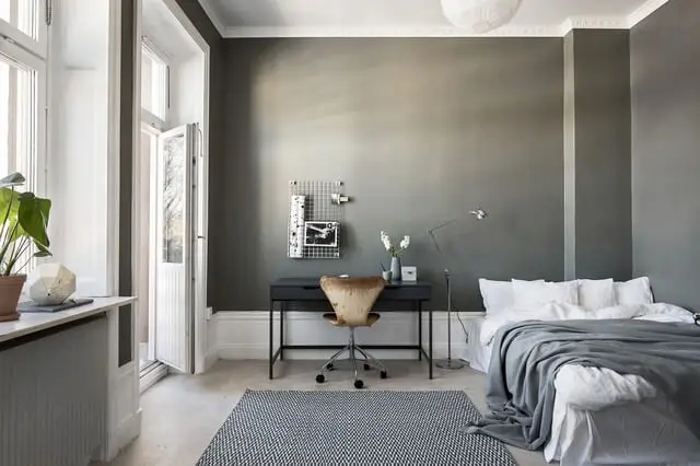
With a little breathing space, your room can actually feel cozier and more relaxing. The goal is to create negative space by using blank spaces to provide a sense of balance in your bedroom.
Wallpaper:
You don’t have to completely disregard the idea of wallpapers for more breathing space. Instead, wallpapers can easily be used to create negative space so long as you use them strategically. The key is to use simple and light patterns instead of heavy ones. For example, use botanical patterns with light colors instead of a geometric design.
Also, use only one wall for the wallpaper that is behind the head of your bed.
Windows:
Unlike living rooms, bedrooms require complete privacy and are cut off from natural light to sleep properly. In this case, removing curtains or drapes is simply not an option. Instead, the better option would be to leave the space around the window empty. By clearing the items that will tempt the eye to focus elsewhere, you can enjoy the view outside to the fullest.
Bed:
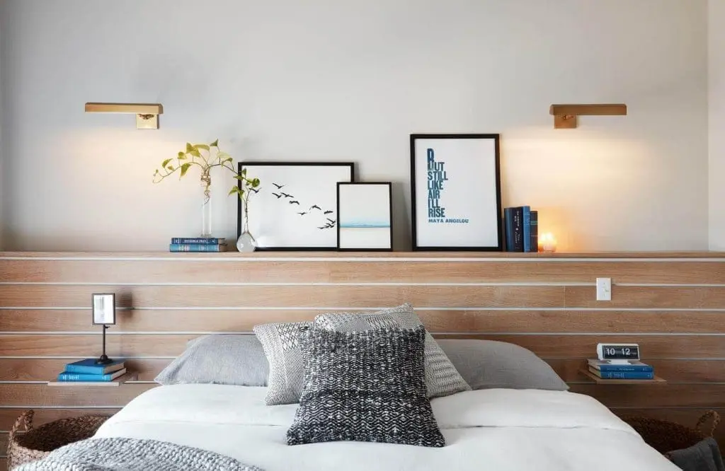
It goes without saying that your bed would be the most important piece of furniture in your bedroom. So, you can decorate your bedroom in such a way that would let the bed capture the most attention by leaving the space around the headboard unfilled. Wall decorations, bedside tables, or any other items that are too close to the bed will compete for the attention of the viewer.
Kitchen:
Most homes don’t have large kitchens, so homeowners try to maximize storage in that limited space. It creates a cramped feeling, making the space look uncomfortable instead of inviting.
Cabinets and Storage:
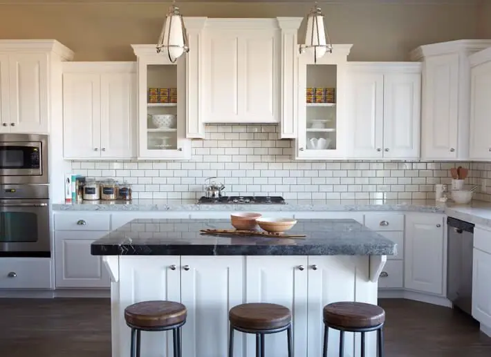
To create more breathing space, try skipping wall-hung cabinets that look bulky and take up a lot of space. Instead, opt for shelves displaying decorative accessories that are also easy to access. This will make the area above the countertop look much more attractive than it would with large cabinets.
Odd Wall:
Almost every kitchen has a wall where no appliance is suitable for it or not enough space to support anything beneficial to the kitchen. We usually just leave it be and focus on the more “useful” elements of the kitchen. However, that odd wall that you neglected can also be used as a decorative focal point if you add color to it, enhancing the rest of the space. You can start by painting it in a bold accent color and even adding decorative pieces to it as a way to make the best of that negative space wall.
Kitchen Island:
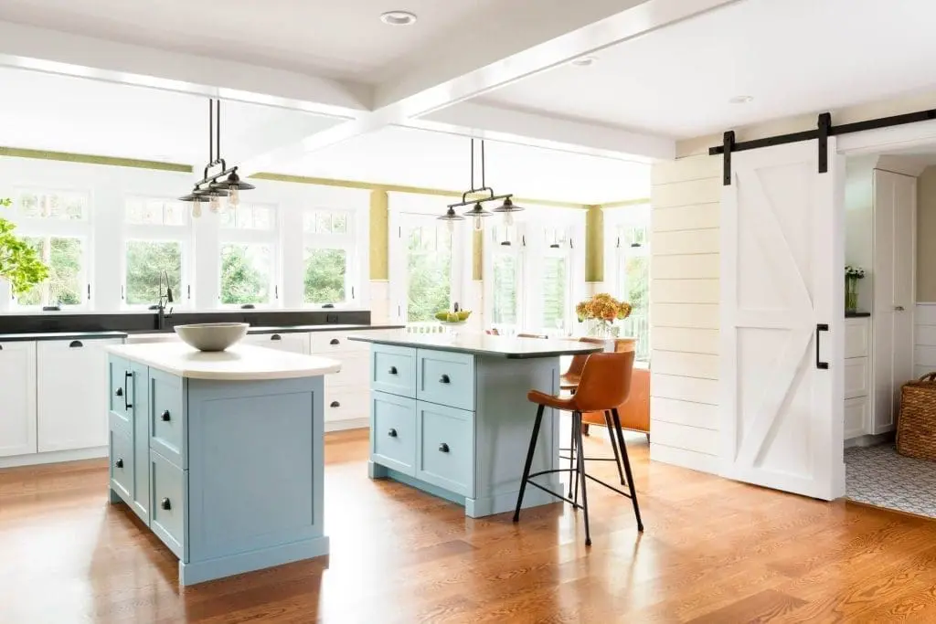
If you have a bigger kitchen, then you can incorporate a kitchen island that is raised above the floor. The slightly elevated island leaves a lighter impression than one that occupies the floor and allows a long view through the room that focuses attention on the central part of the room. The furniture used in kitchen islands can make the best use of negative space as they keep the view uncluttered.
Bathroom:
Like the kitchen, bathrooms are also small spaces where it can be challenging to strategically incorporate the components as well as take note of the aesthetics. However, just as any room in our house, bathrooms need negative space since they can allow bold decorative choices to be successful even in a bathroom of relatively modest size.
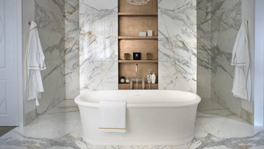
Patterned Tiles:
Patterned tiles are excellent elements to make the best use of negative space. They can make any space look richly dramatic as compared to simple plain tiles. Not only has that, but the bold color of patterned tiles can easily catch your eye.
If you are thinking of installing patterned tiles in your bathroom, then choose the ones with two colors, one a bold accent color like yellow, orange, red, and the other a neutral color like white, beige, and ivory.
Wall-Hung Furniture:
When creating negative space in a room, using light and sleek furniture is a crucial factor. Choosing wall-hung furniture for the vanity area can increase the negative space in that particular area. As a result of incorporating wall-hung furniture, your bathroom will look more airy and comfortable. The furniture can make an elegant focal point.
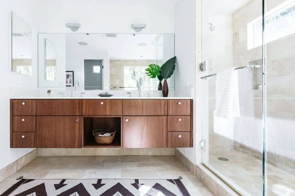
Glass-Screen:
Shower screens ensure your bathroom stays splash-free whilst you shower. However, apart from its practical use, it can also be used as a means to create negative space. The near-invisible glass screen creates negative space as it lacks a frame.
This allows the viewer’s eye to travel beyond the glass partition.
If your room is strategically planned and looks visually balanced, then it allows one to linger their eyes on important elements such as textures, patterns, instead of drifting aimlessly without noticing individual objects.
However, it should also be kept in mind that you can fill up the space if it doesn’t feel right. If the negative space you created isn’t the breathing space you wanted, then it is not necessary to purposely leave it blank.
By;- Tulisha Srivastava

