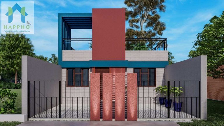
Clients and Designers are finding ways to coordinate color schemes in the décor to bring the best out of spaces for combinations that can relax and energize the aura.
Each space or picture experienced is judged by the color appeal for each pixel. The environment and its colors are perceived, and the brain processes and judges what it perceives on an objective and subjective basis. Colour is an integral element of our world, not just in the natural environment but also in the man-made architectural environment.
Colour is an expressive element in architectural design and can be used to emphasize the character of a building and create harmony and unity, or it can be deliberately contrasting to enliven or emphasize. It may affect how people respond to their surroundings and can enhance a mood of calm or elation. Colour plays a significant role in the perception of a space in the human mind. When lighter shades are used, it makes the space appear bigger. On the other hand, using darker shades make the same space look smaller. Hence colors can be used to adjust the proportion of a building space.
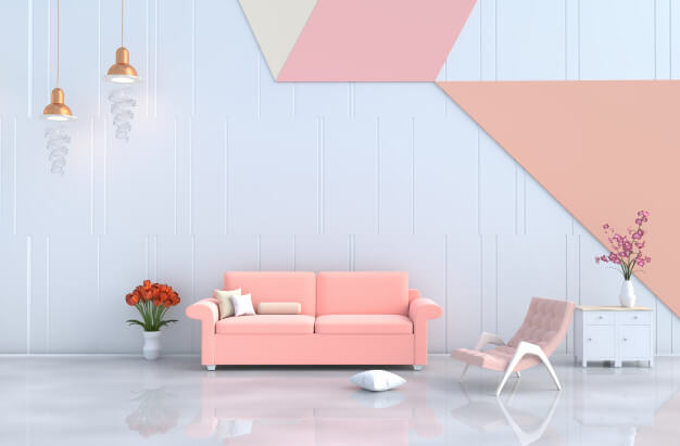
Color Schemes in an interior décor palette can be used to relaxing effect without overpowering the presence of color, However, the myth of pastel colors being dull and boring would be debunked through a series of ideations.
Inspiring Furniture
Furniture is an artifact for spatial mood lifters, thereby can be selected in favorite tones. Designers can select such pastel tones for furniture to add a bit of subtle and sober look to the interior.
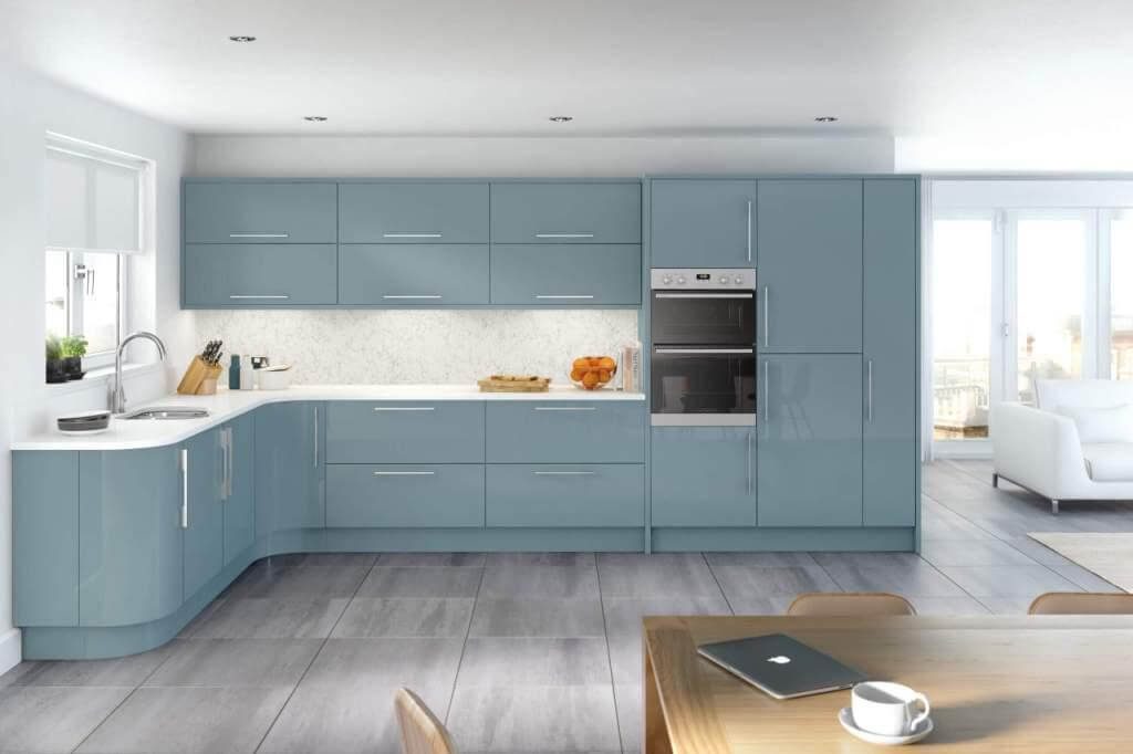
Schemes for Cabinets and Wardrobes
Storage Elements are an essential and major space-occupying in any interior. Applying such pastel tones onto the cabinets create a focal spot to visualize in a frame. These planar surfaces with these relaxing and calm shades create a soothing mood.
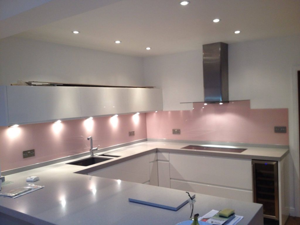
Workstation Backsplashes
Kitchen walls beside the workstation are the ones with most of the visual focus, thus direct implication of softer shades as an element of creativity to highlight a scheme.
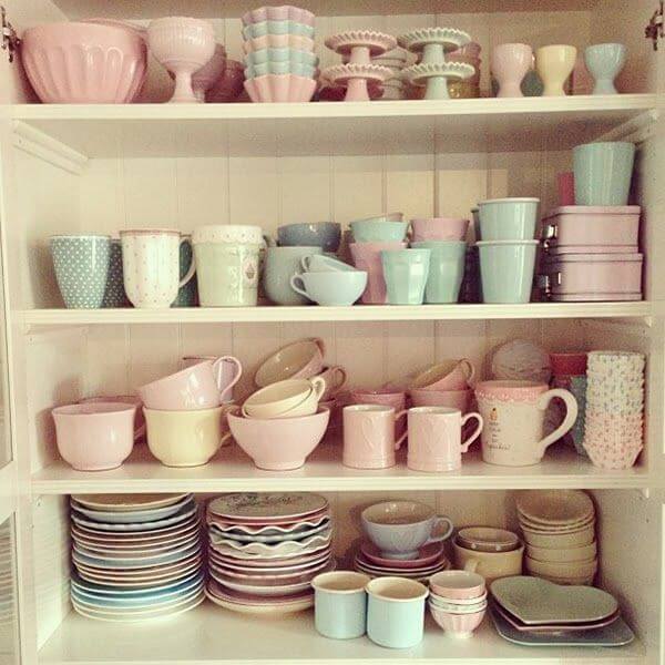
Crockery and Dining Style Systems
Crockery and dine in elements play an important part to showcase the Interior décor. Designers consider crockery design as an integral element of display, thereby using pastel schemes in coordination with interior tones of dining entities can be a big boost with lower scale implication.
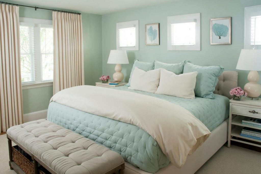
Soft Furnishing and Upholstery
Some of the major problems of nomadic living culture can hold the idea of designing spaces as per a permanent ideation. Thus a solution to these problems is to apply soft furnishing elements like curtains, carpets, and furnishing upholstery with a touch of subtle and relaxing tones of soft color palette like pastels.
Juxtapose Elements
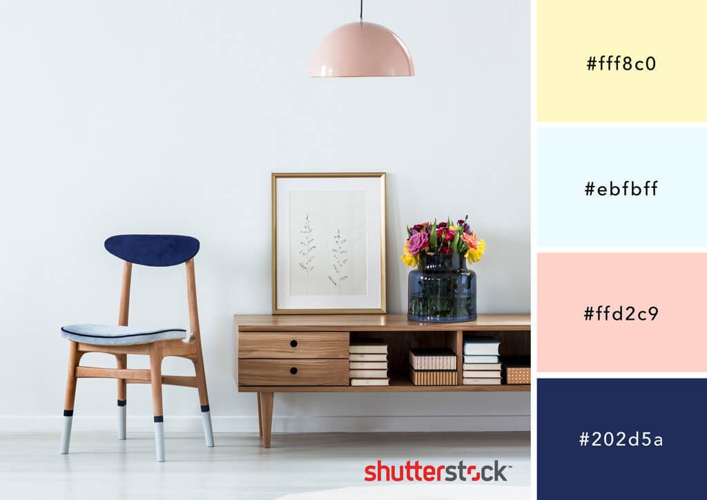
An effective way to make a focal element out of a small effort is to juxtapose the main scheme via a scheme of opposite nature. Users with a dark and strong décor can use a contradicting scheme of softer tones in macro elements to shine out of the whole frame.
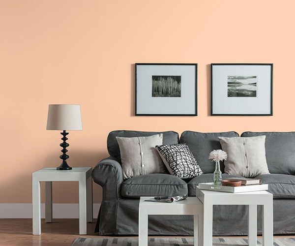
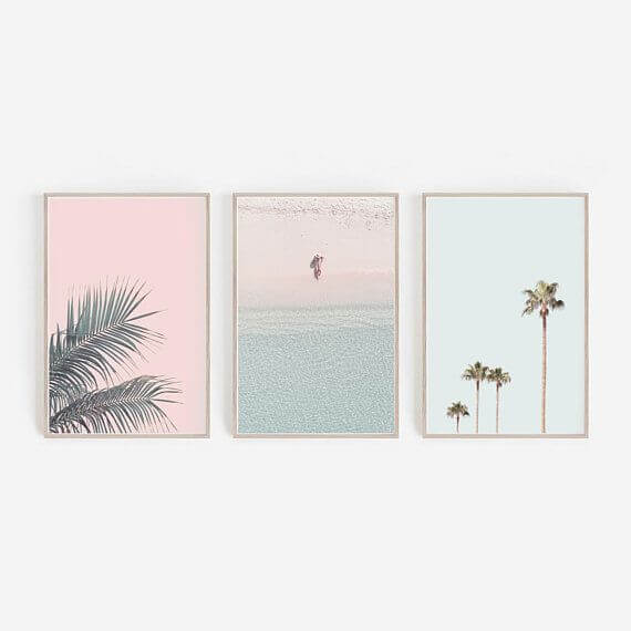
Wall Arts
The art pieces hung on the wall are focal master-elements for experimentation with pastel hues. The main idea to use such wall hangings, creates a focus that shifts visual balance into a zone of relaxation and brighter yet softer spatial arrangement.
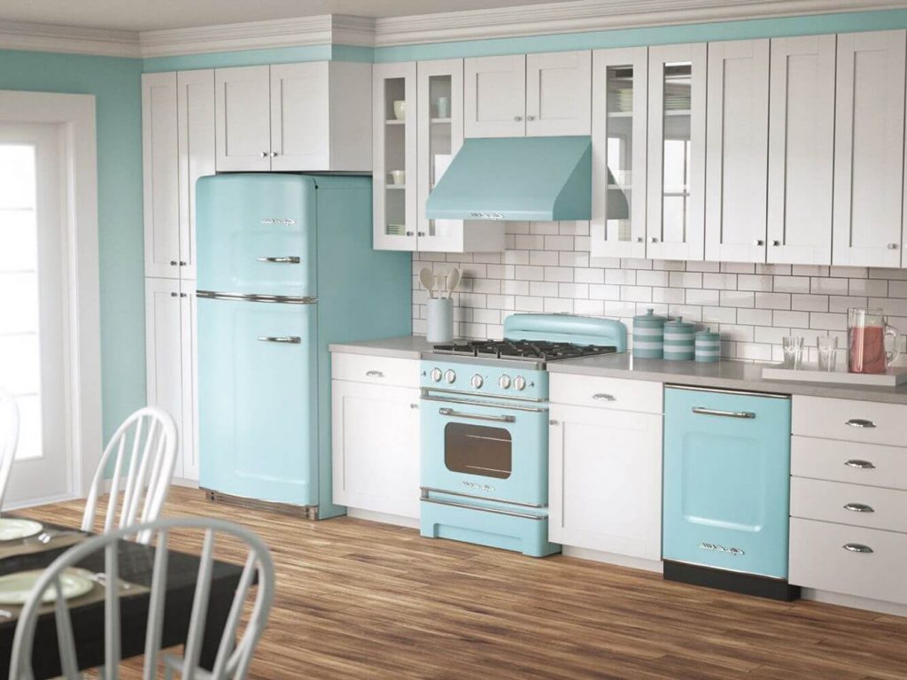
Kitchen Appliances
Kitchen Ideas define an aura of feeling nearby the kitchen décor likely to be the dining area, Kitchen, attached culinary garden and many more to consider. The major space to volume ratio occupied in the kitchen is through appliances. Thus, it is a good idea to decorate interior scheme through them accordingly.
Warm Wood Pastel Tones
Pastel shades do not only state the idea of creamy-baby shades, the basic intent is to imply a sober scheme set. Wood tones in a pastel palette offer lighter visual appeal yet a defining statement.
– Anshul Kulshrestha