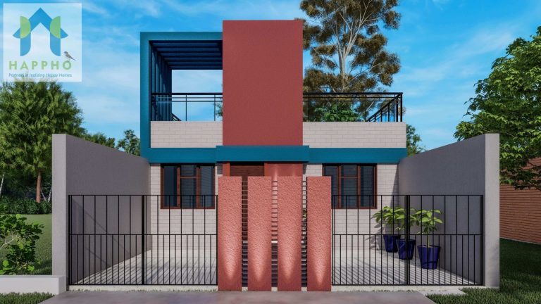
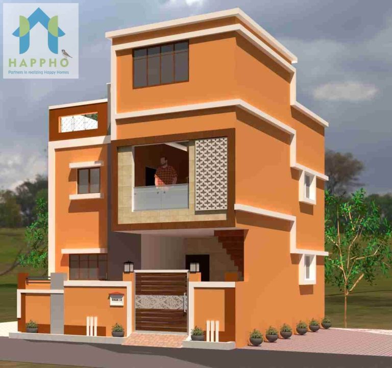
A major portion of investments is spent on acquiring a property, and on average small houses are a majority of choices for initial stages of investments. People tend to maintain a scope for maintenance and living costs by investing in a smaller space. However, this should not be a reason to utilize it as a small scale proposal for living. Design the space such that it corresponds to the living for maximum habitable characteristics and visual appeal.
A shift in the paradigm of living has challenged the human lifestyle to decrease the footprint of the building and adapt to small spatial arrangements. Designers in prime locations, specialize in creating potential designs for house ideas for optimum usage of every possible ideation.
Owners and clients tend to make some common mistakes while adapting to small space and their makeover.
Some of the common mistakes that should be avoided to upscale the small scale house are mentioned.
1. Mismanaged Planning
Users commit this mistake of designing spaces on their own without professional consultancies or architects and designers. The former mistake can lead to poor planning of spaces with unutilized areas.
Smaller spaces require intense design process with strong decisive planning techniques and experimentation rather than random space inhabitancy.

2. Constrained Design
Occupants in small houses tend to save space by choosing mini versions of furniture or artifacts. Counter-theory of design suggests that a bold statement can be displayed in small areas through dramatic proportionately big furnishings.
However, this does not imply that oversize or disproportionate fittings can be proved bold rather a sense to optimize the feeling of space by using the hot-spots of the visual frame even in the smallest room.
3. Darker Shading palette
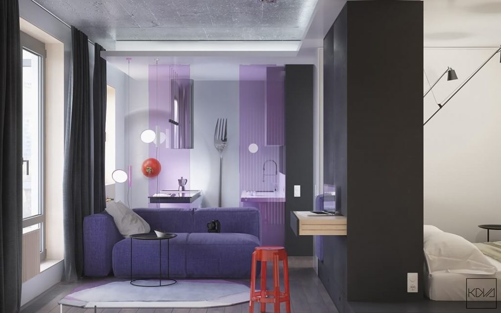
The visual appeal of a color scheme has an impact on the human mind. Illusions of space constraints are subject to the color palate in a volume.
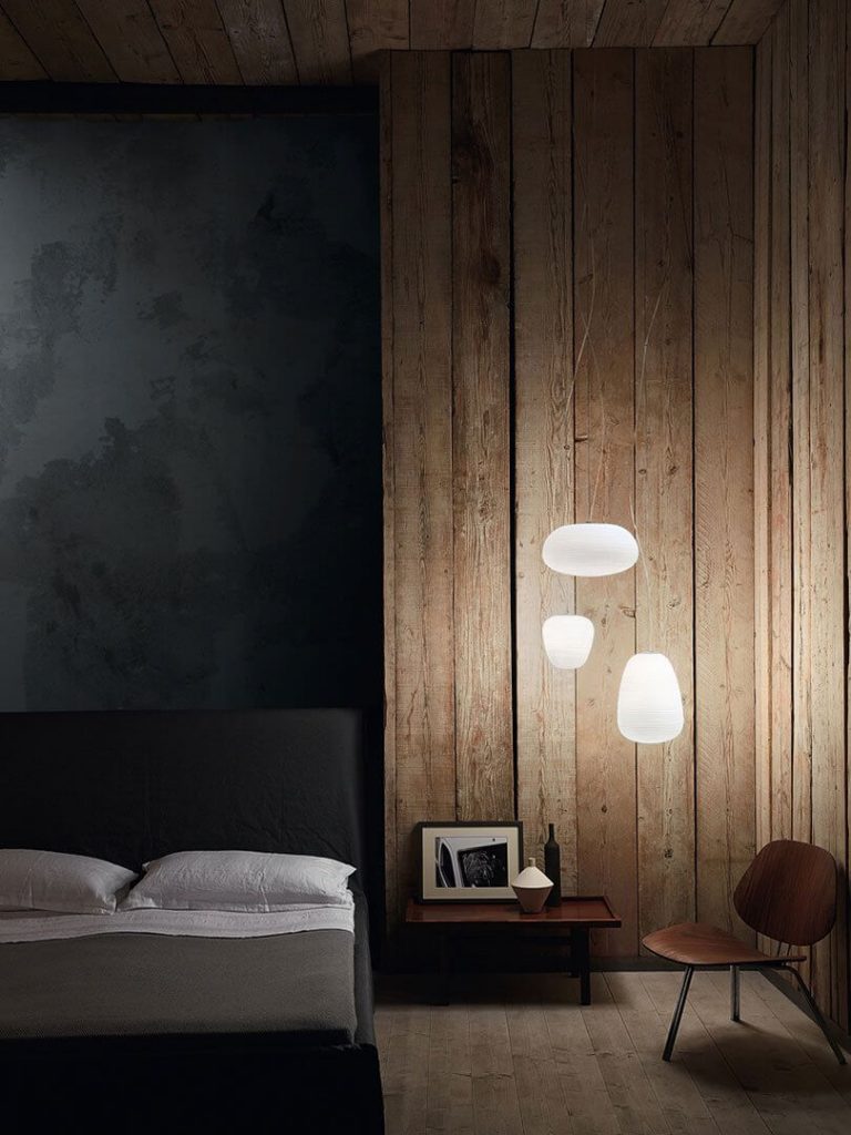
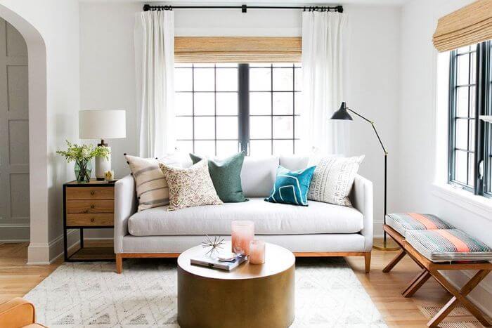
Darker shades restrict the visual volume and create an illusion of compact and closed spaces, whereas the use of lighter shades creates has an impact of expanding volume with an open appeal.
Designers can approach shading schemes with volumetric expansion, such as extending shade schemes used on walls to the ceiling too. This creates an unbroken seamless volume within an enclosed scope of space.
4. Exclusive Spatial Clutter
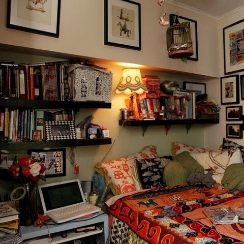
Too many passions in a small space can create a cramped feeling and lesser space for circulation too. Filter the stuff according to the utility and sieve through the essentials only. Smaller volumes complement the minimalistic design with negligible clutter and artifacts that are essential in the function aspect.
While considering compact spaces for living, the instinct to hoard onto anything not substantial like crockery, artwork, or furnishings won’t be feasible for tiny houses.
So, clutter-free arrangements can be open and airier.
5. Dingy Lighting Scheme
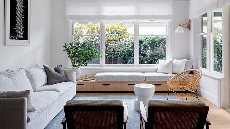
A spectator feels spaces and volumes through vision. As the Vision gets clearer, the Experience also gets clearer. Instead of keeping windows and natural light sources blocked, one must look forward to incorporate natural light whenever and wherever possible.
In a dull space the volumes tend to show a contracted and cozy character due to the subdued color appeal. Well illuminated spaces expose the most out of the color palette and create an aura of open and big volumes.
6. Gravitating towards the wall
A common saying suggests the “Perks of Being a Wallflower”, certainly not in the case of Small Houses in terms of furnishing arrangements. A common approach of occupants in a habitable arrangement leads to placing all the furniture along the wall lining or the perimeter.
Surprisingly this leads to confined design with lesser volume for the experience of a space. An ideal arrangement for smaller spaces suggests open planning with not too many furnishing along the wall and voids of volume for circulation and occupancy.
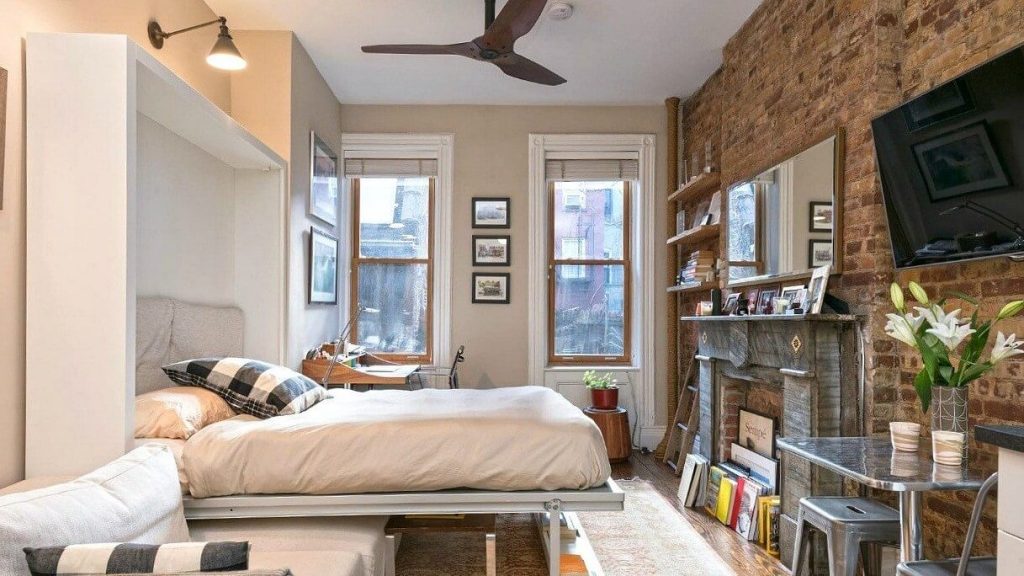
7. Lackluster Ambiance
An ambiance with illumination seems pleasing to the eye and creates volumes with utmost effects. Illumination does not confine its limit to lighting up a space without defined focus, moreover, lustrous lighting techniques with a focus on function spots can be revealing for the volume and spatial arrangements.
Special lighting techniques implement ambient lighting around the small enclosure which enhances the visual expansion of volume.
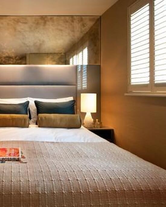
8. Neglected Volumes
While considering solutions for smaller and compact spaces, many of the users and Designers restrict their solutions to spatial arrangements in the footprint of the building.
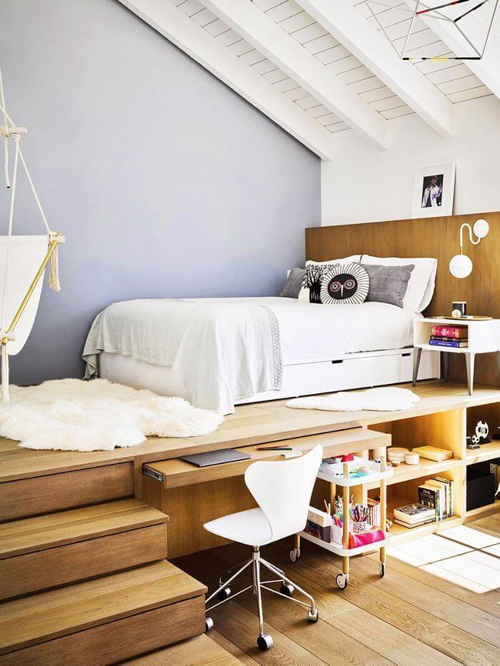
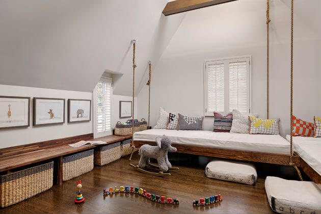
Thus a major portion of volumes is neglected and is left unused. Most of the volumes can be utilized in different manners such as:
- Storage units
- Mezzanine leisure areas
- Multivolume Transformable Furnishing
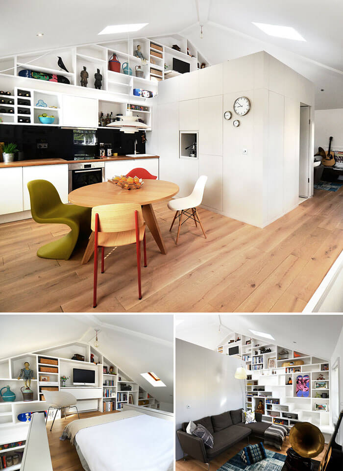
9. Unnoticed Latent Storage
Storage of utilities is an essential part of planning, but in a small place, It is crucial for functionality and usage. The major concern is to exploit the vertical spaces and spaces under the bed or furnishing or even in the enclosure of these furnishings.
Areas that can be ideal solutions for latent storage possibilities are:
- Vertical volumes
- Furniture Storage
- Above the door level or over lintel level volumes
- Under the staircase volumes
10. Compartmentalization
Tiny compact spaces require a focus on functional distinction without a physical barrier. A common mistake committed by habitants of smaller arrangements is that they tend to divide spaces through the compartment or visually break the space. This leads to an even smaller experience of the space.
Use of physical distinctions like room segregation, Different flooring patterns, Color schemes, or even carpet should be cautious.
Consider to stick with continuity to give a sense of flow to open out spaces.
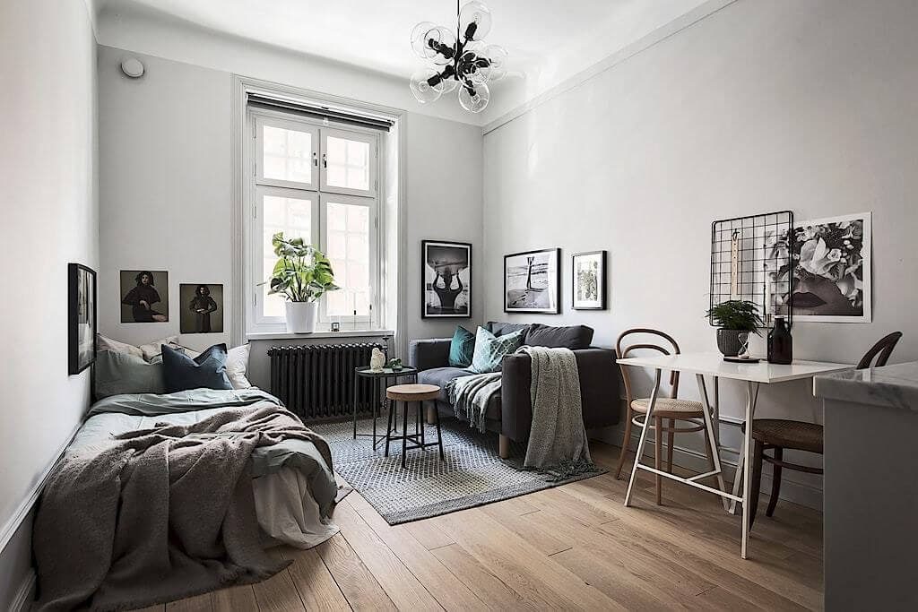
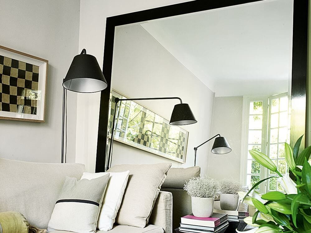
11. No mirror Planes
Mirrors are a virtual space expansion tool. Visual expansion through a mirror can be achieved to double the volume virtually.
They do not only cast implied pseudo images, rather the theory behind this virtual image formation does the trick. This reflected Image creates virtual volumes and also scatters the light from the source multiple times, so that the effect of light expands the experience indirectly.
The use of full-length mirror planes along the wall can be highly effective for small places; Mirrors can be placed opposite to each other for creating an Infinity effect.
12. Rule Bound Proposals
Protocol Designing is ideal for cases with the scope of implementing basic rules. Small spaces require an out of the box thinking and experimentation which stands out with different options of functionality. (DO NOT STICK TO RULES: “EXPERIMENT!”)
Commonly derived rules of architecture do not apply in these compact arrangements due to lack of space orientation. An architect must come up with ideation by experimenting in available space. Ways to implement experimentation can be:
- Using transformable furnishing
- Multi-Tasking Spaces
- Common area Planning
- Customizing Products according to need
13. Under-Embraced Potential Judgement
Pre-judgement without analyzing the potential of the space can be misleading while designing it. Designers should not constraint the mindset to limited and restricted function or utility for smaller spaces.
One should not skimp on the research quotient for designing. Keep a vision for design that works out as the best solution rather than a presumption of a vague perception of the first glimpse.
An open assumption of spaces, Varied design Ideology for function and aesthetics can be a solution for not generalizing Small House.
Ideas must be pondered upon by responding to the need as per the design solutions stated above.
– Anshul Kulshreshta


